


使用ggplot2套件完成基本的資料視覺化後,就是調整整體繪圖的外觀色彩,此時主要使用的圖層就是 ggplot2 theme(),來調整非資料面的繪圖的三大元素(3 elements):文字(text elements)、線條(line elements)、方形(rectangle elements)。
ggplot2 theme 3 elements
- text elements: plot titles, axis title, legend title, text, axis tick mark labels, 等。
- line elements: axis lines, minor and major grid lines, plot panel border, 等。
- rectangle elements: plot background, panel background, legend background, 等。
而在theme()圖層中我們用來調整3元素的主要函數如下:
- element_text()
- element_line()
- element_rect()
以下我們將使用R ggplot套件中的txhousing資料集進行示範。txhousing為 TAMU real estate center (http://recenter.tamu.edu/)房仲中心收集有關Texus德州房市的資料。資料共8602個觀測值和9個變數,包括city, year, month, date, sales(number of sales, 銷售量), volume(total value of sales, 總銷售金額), median(Median sale price, 銷售額中位數), listings(Total active listings, 總有效房源), inventory(“month inventory”,表示銷售房源所需的月份時間)。
Step 1: 繪製資料圖層
載入所需套件。
|
1 2 |
library(ggplot2) library(ggpubr) #ggarrange() |
先繪製各時間點各城市的房市銷售量圖。
|
1 2 3 4 5 6 |
data(txhousing) df g1 ggplot(data = df) + geom_line(mapping = aes(x = date, y = sales, group = city, colour = city)) g1 |
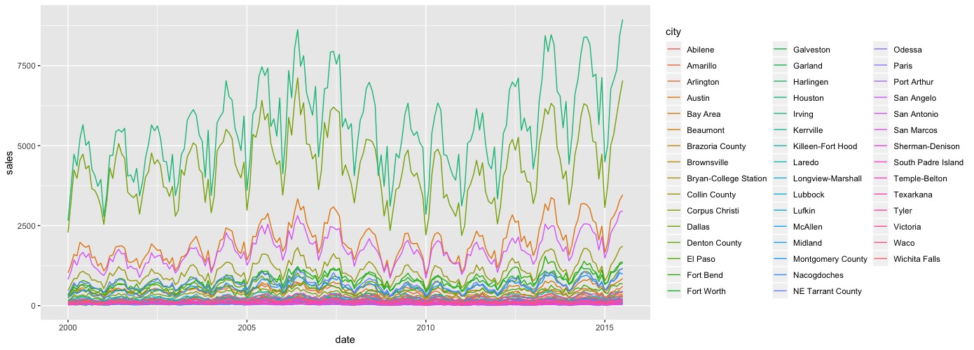
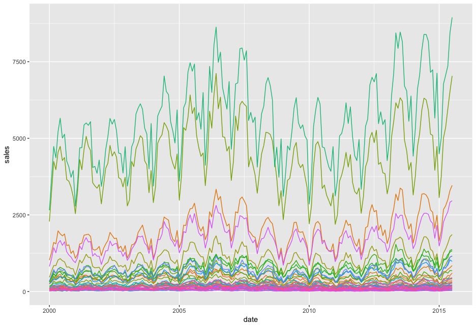
不顯示圖例。使用theme圖層的legend.position,值可以是(“none”, “left”, “right”, “bottom”, “top”, or two-element numeric vector)。若要不顯示,即指定值為”none”即可。
|
1 2 3 4 5 |
g2 ggplot(data = df) + geom_line(mapping = aes(x = date, y = sales, group = city, colour = city)) + theme(legend.position = "none") g2 |
Step 2: 套用快速佈景主題
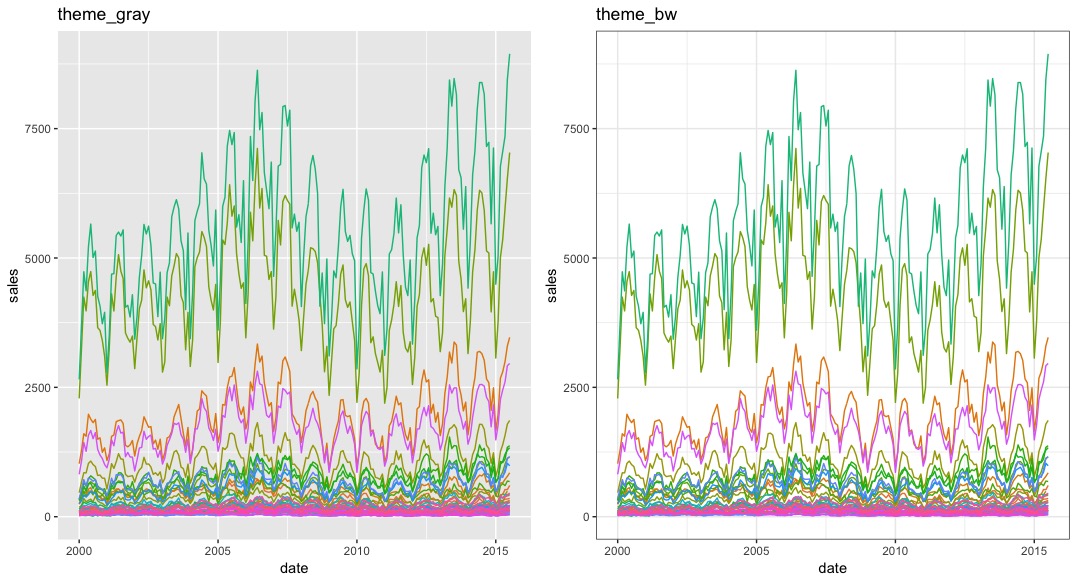
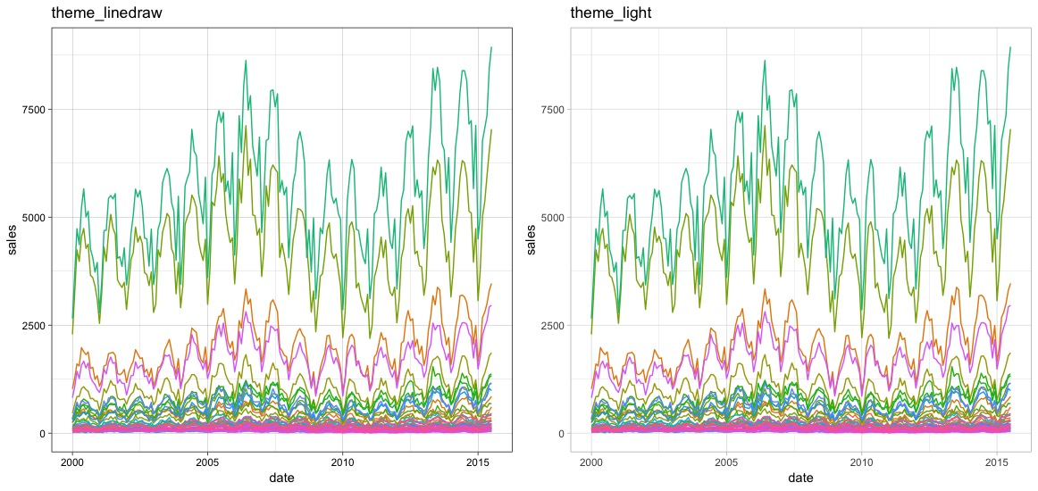
我們試使用幾個ggplot2內建的快速佈景主題函數。*因為主題內建會顯示圖例,為了使不顯示圖例,我們亦另外使用theme(legend.position = “none”)。
- theme_gray(): panel.background底色為深灰。
- theme_bw(): panel.border有上色,panel.background則為白色。
|
1 2 3 |
p1 p2 ggarrange(p1, p2, nrow = 1, ncol = 2) |
- theme_linedraw(): panel.border有邊框。
- theme_light(): panel.border邊框為淡色。
|
1 2 3 |
p1 p2 ggarrange(p1, p2, nrow = 1, ncol = 2) |
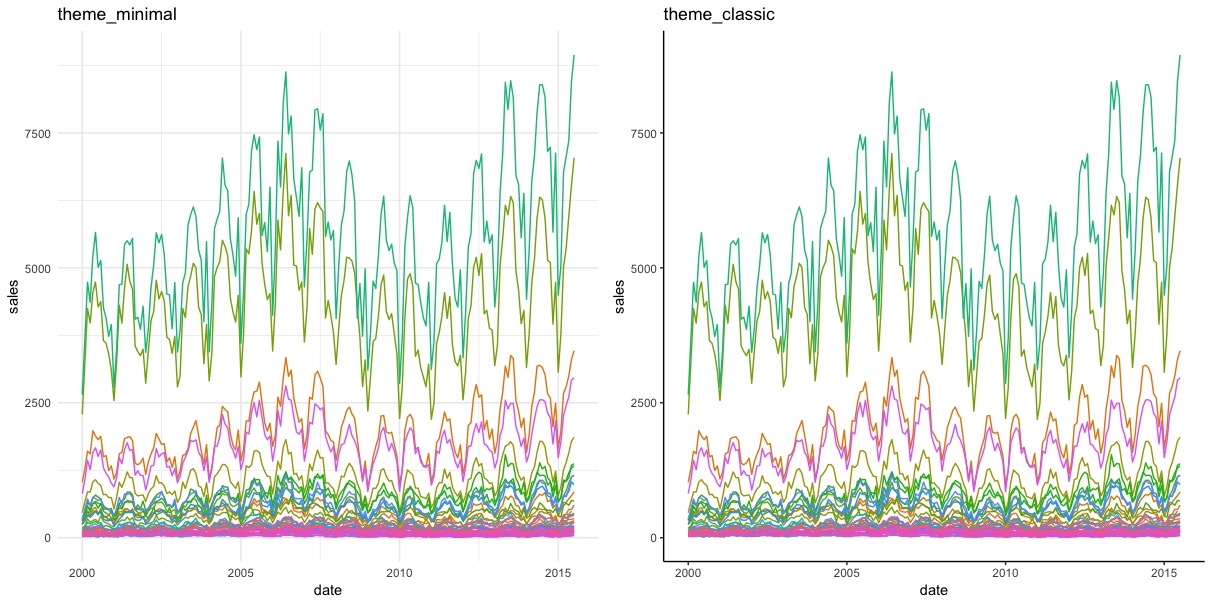
- theme_minimal(): 沒有panel.border。
- theme_classic(): 只剩axis.line。沒有panel.grid.major, panel.grid.minor格線。
|
1 2 3 |
p1 p2 ggarrange(p1, p2, nrow = 1, ncol = 2) |
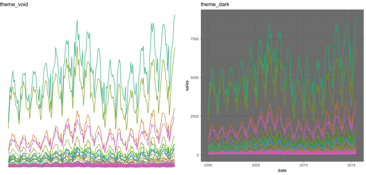
- theme_void(): 拿去所有panel格線(grid)與邊框(border)
- theme_dark(): 深色panel.background。
|
1 2 3 |
p1 p2 ggarrange(p1, p2, nrow = 1, ncol = 2) |
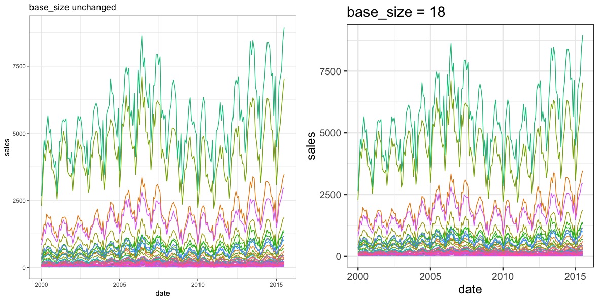
這幾個快速佈景主題函數theme_xx()亦可搭配
- base_size : 基本的字體大小(可改變所有圖形上的文字元素)
- base_family : 基本字體family
|
1 2 3 |
p1 p2 ggarrange(p1, p2, nrow = 1, ncol = 2) |
Step 3: 更改plot panel的背景色彩(background colours)與格線(grid lines)
panel的背景色彩屬性為panel.background。我們可以使用以下element_rect()中的幾個屬性來調整:
- fill: 填充顏色。
- colour: 外框線條顏色。
- size: 外框線條粗細。
- linetype: 外框線條樣式(blank, solid, dashed, dotted, dotdash, longdash, twodash)
|
1 |
g2 + theme(panel.background = element_rect(fill = "snow",colour = "mediumorchid",size = 0.5,linetype = "solid")) |
panel的背景主要、次要格線屬性分別為panel.grid.major, panel.grid.minor。我們則使用element_line()中的幾個屬性來調整:
- colour: 格線顏色。
- size: 格線粗細。
- linetype: 格線樣式。
|
1 2 3 |
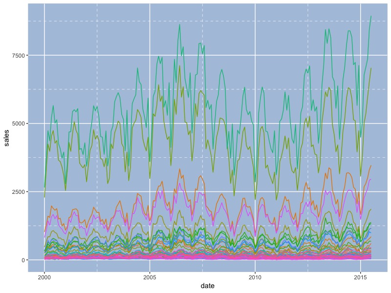
g2 + theme(panel.background = element_rect(fill = "lightsteelblue",colour = "lightsteelblue",size = 0.5,linetype = "solid"), panel.grid.major = element_line(colour = "white",size = 0.5,linetype = "solid"), panel.grid.minor = element_line(colour = "white",size = 0.25,linetype = "dashed")) |
Step 4: 移除panel的邊界border和grid lines格線
如果要移除元件,則可使用element_blank()函數。
|
1 2 3 |
g2 + theme(panel.grid.major = element_blank(), panel.grid.minor = element_blank(), panel.border = element_blank()) |

如要留下兩座標軸,則可以調整axis.line屬性。
|
1 2 3 4 |
g2 + theme(panel.grid.major = element_blank(), panel.grid.minor = element_blank(), panel.border = element_blank(), axis.line = element_line(colour = "lightgray",size = 0.5,linetype = "solid")) |

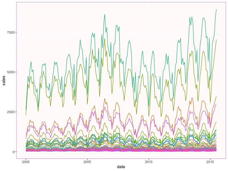
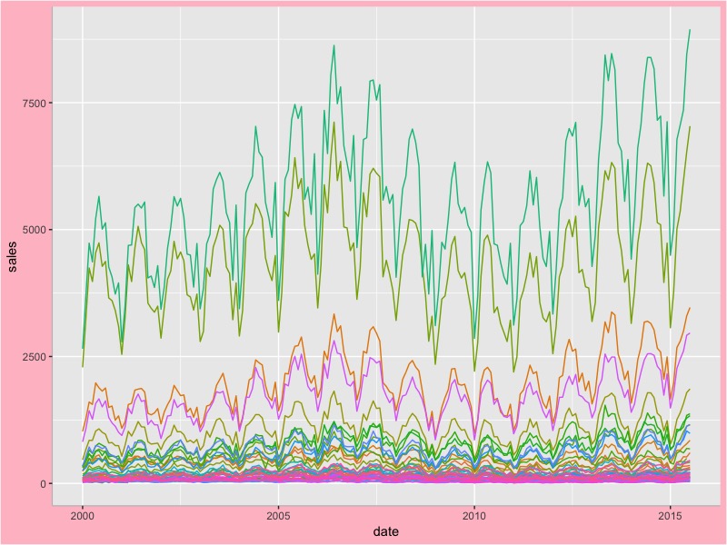
Step 5: 調整繪圖背景plot background(不是panel background)
改變plot.background的屬性。並移除panel border保留兩軸線。
|
1 2 3 |
g2 + theme(plot.background = element_rect(fill = "pink"), panel.border = element_blank(), axis.line = element_line(colour = "grey",size = 0.4,linetype = "solid")) |
Step 6: 使用客製化佈景主題custom theme
ggthemes套件內有多組客製化佈景主題themes和scales,可以一次性改變你的繪圖外觀樣貌。
更多詳細的ggthemes套件說明請參考:https://jrnold.github.io/ggthemes/reference/index.html
|
1 2 |
install.packages("ggthemes") library(ggthemes) |
我們來試試幾組佈景主題theme_xx()搭配對應的scale_yy_xx()(yy: color, fill, shape, linetype) 或是綜合color,shape,linetype的組合等。
6-1. Themes based on Stata graph schemes
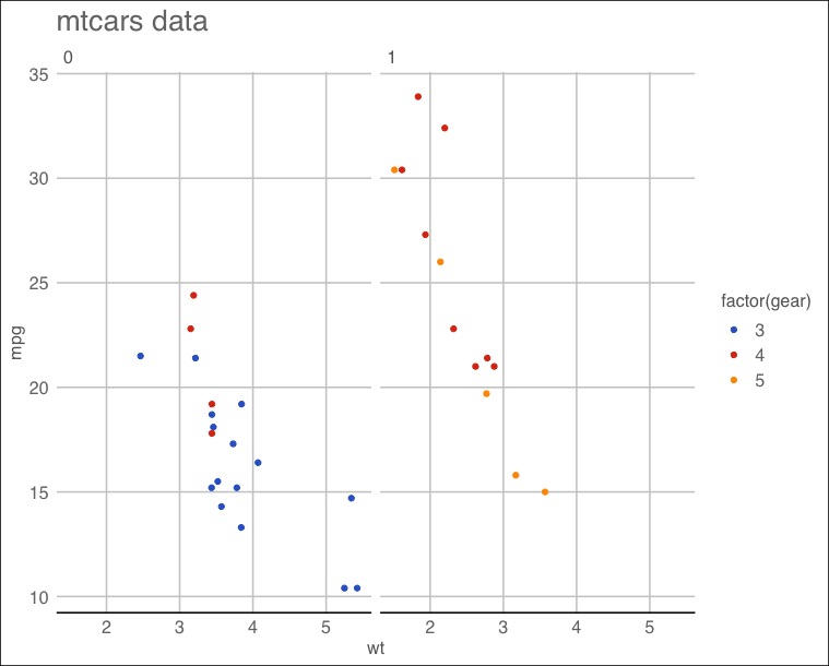
使用theme_stata()佈景主題,並調整字體大小。
|
1 2 3 4 5 6 |
p geom_point()+ facet_wrap(facets = ~ am) p + theme_stata(base_size = 16) + ggtitle("mtcars data") |
加上主題色調。
|
1 2 3 |
p + theme_stata(base_size = 16) + scale_colour_stata() + ggtitle("mtcars data") |
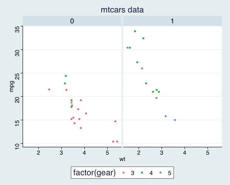
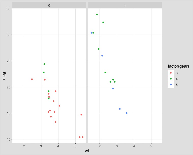
6-2. Theme with Google Docs Chart defaults
|
1 2 3 4 |
p geom_point(aes(x = wt, y = mpg, colour = factor(gear))) + facet_wrap(~am) p + theme_gdocs() + scale_color_gdocs() + ggtitle("mtcars data") |
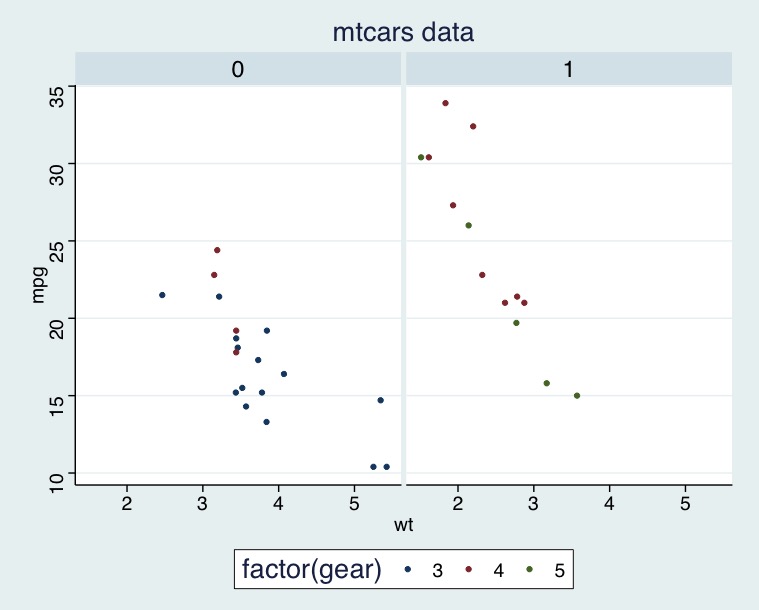
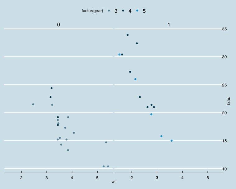
6-3. Inverse gray theme
|
1 2 3 4 |
p geom_point(aes(x = wt, y = mpg, colour = factor(gear))) + facet_wrap(~am) p + theme_igray() |
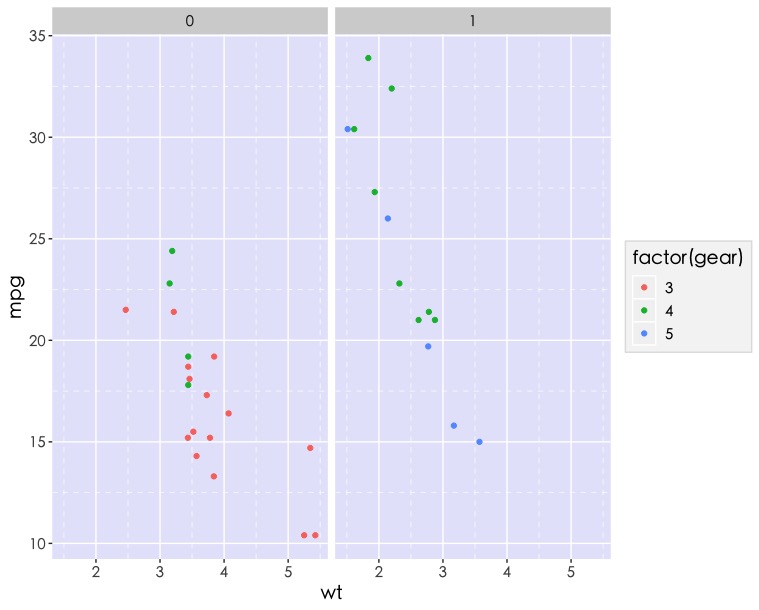
6-4. ggplot color theme based on the Economist
|
1 2 3 4 5 6 7 8 9 |
p geom_point(aes(x = wt, y = mpg, colour = factor(gear))) + facet_wrap(~am) + # Economist 將x軸標示在右邊 scale_y_continuous(position = "right") #使用economist佈景主題與色調 p + theme_economist() + scale_colour_economist() |
step 7: 自製客製化佈景主題(★★★★)
方法1: 使用theme_set() 函數設定當下R session的佈景主題。
|
1 |
theme_set(theme_gray(base_size = 20)) # not run |
方法2: 你可以自訂函數。舉例:自訂theme_self()。
|
1 2 3 4 5 6 7 8 9 10 11 12 13 14 15 16 17 |
p geom_point(aes(x = wt, y = mpg, colour = factor(gear))) + facet_wrap(~am) theme_self { theme(panel.background = element_rect(fill = "lavender"), panel.grid.minor = element_line(linetype = "dashed"), text = element_text(family = base_family, size = base_size), legend.background = element_rect(fill = "gray96",colour = "gray88"), plot.title = element_text(hjust = 0.5), #標題置中 strip.background = element_rect(fill = "lightgray", colour = NA) # axis.line = element_line(colour = "mediumpurple4") ) } p + theme_self() |
總結
有了對ggplot2 theme()圖層的三元素(text, line, rectangles)有了基本的了解,即可將自己常用的繪圖屬性設定自製成theme_xx()以後便不用重複更改或重複撰寫程式碼,並且可以根據喜好調整,不受現有的佈景主題所限制。
更多R資料視覺化學習筆記:
- ggplot2 | 簡易資料視覺化 Basic Data Visualization – part1 | using R SQLite
- dual y-axis plotting 雙Y軸 繪圖 | R 資料視覺化 Data Visualization 小技巧
- Summarize Categorical Variables | 類別變數摘要 | 統計 R語言
參考連結: